New Logo: Commerzbank
November 4, 2009
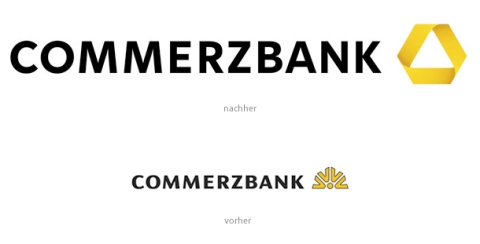
Commerzbank has got a new logo after the fusion with Dresdner Bank.
I think its really a good one. The signet shows parts of the former logos of the two banks. The yellow semi circle symbolizes the Commerzbank, the ribbon comes from Dresdner Bank. Maybe the fonts of the old ones were a bit more delicate which made it better to read. The signet is now shown in 3D because of the colour gradient. That makes it more noble and more interesting to hanle in videos.
All in all it is fresh and modern.
The norwegian post has changed corporate design
July 23, 2009
The norwegian post has changed the corporate design. At the first moment you think it’s really a hard step and there is nothing from the old one left. But then you see that it’s the abstract form of the post horn. Well, I think the new modern look instead of a realy good old logo is not always the right way. But here you have to ask why did they want to have a new coporate design? And the answer is: because they want to be more present on the european market. Ok, that’s a reason. But, couldn’t they do it with the old one? I mean, this traditional old yellow post horn which has already cult status not even in Norway is really not a logo which you can just throw away. It symbolizes tradition and history. The new one is cold and futuristic and will never get the charme like the old one.
I will miss the yellow post horn!

But it’s not only the change of the “Posten” logo. Now there is a second one, the “Bring” logo. What I really like is that it fits perfectly together and completes one another.
Icons
July 19, 2009
Aren’t that funny icons? I think it really fits to nearly every designer! And the other professions hit the mark as well…
![]()
Clock
June 7, 2009
Intriguing clock by icelandic designer Thorunn Arnadottir.
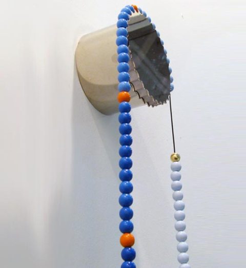
The concept: “Each bead in the necklace represents 5 minutes, and the whole necklace a one solar day. The orange and red beads represent the whole hours. As the wheel turns, one bead falls off and drops down the string.To tell time one must count the beads from the silver bead (midnight) or the golden bead (noon) to the last bead that fell off the wheel.
With this project my aim was to create a more ’emotional’ perception of time, measured in relation to events in one’s life rather than rigid units by which most of us slice up our day. Which is where the beauty of this project is revealed: for although the beads themselves do represent units of time when positioned on the wheel, they can also be removed from the wheel altogether, representing freedom from time. Then you should wear the necklace proudly around your neck as a statement that you are “in control of your minutes.” ”
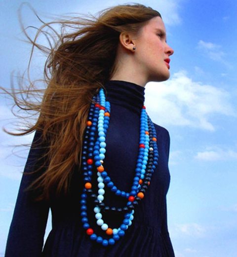
Well, i certainly like the “in control of your minutes” thing! The clock itself is certainly one of the mostu unusual ones i´ve seen, a truely novel concept of visualizing time.
Free Encouragment
April 12, 2009
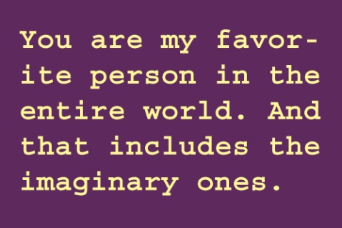
BOOOOOOOM and Design for Mankind have joined forces in the wonderful Project #5: Free Encouragment.
They asked people to submit short personal sentences of encouragment for people they know and created a whole gallery of them for part one of the project.

Because “There is just so much negativity all around us these days, have you noticed? It’s infesting the internet, it’s taking over the big screen, it’s cutting you off, it’s showing up on your bank statement, it’s staining your new shirt, it’s breathing down your neck, it’s not giving you a vacation, it’s talking behind your back, it’s stuffing you in a locker, it’s cheating on you, it’s charging you more, it’s giving you less, and it’s making you miserable!”
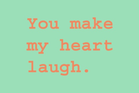
Go and read all of them. They will give you a wonderful feeling and yes, much encouragment. Even if they were not meant directly for you. I think it´s a wonderful project with really awesome contributions. Very inspiring.
The second part which was hosted at the Design for Mankind site asked artists and designers to make postcards out of their favourite encouragment and submit them. Apperantly they made two postcard sets from them which are available at etsy. Sadly there is no gallery of the 400+ submissions online (at least i couldn´t find it) so you might have to click through the etsy site to see a few of them.
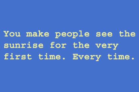
Because of that and because i think the stark graphics are much more powerful than pretty postcards i probably like the first part more 🙂 A truely awesome project.
Neues Museum Berlin
March 8, 2009
The Neues Museum has opened again, 60 years after being bombed in WW2. It is part of the world cultural heritage site of the Berlin museum island.
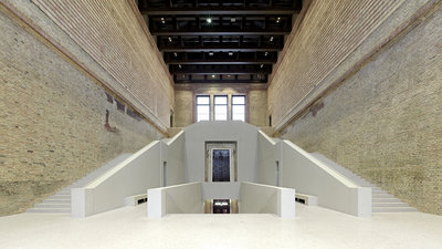
Architect David Chipperfield was entrusted with the task and his plans for the Neues Museum were controversial. There was a lot of critique especially by the citizens of Berlin (of course, architecture critique is a public hobby in germany…)
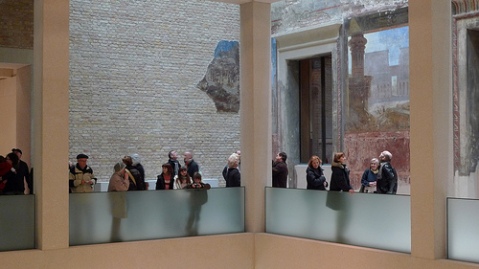
But for the opening (just the building, the exhibitions are not even there yet), people stood in rows waiting 2 hours in the rain to be let in. And so far the majority of the reactions have been postive.
The Neues Museum is certainly unique. A truely modern museum, with state-of the art technique. And (and this is a true miracle) it was 33 millions cheaper than calculated.
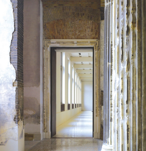
Many people wanted a complete reconstruction of the building. There were enough scars in Berlin they said. Chipperfield decided to keep those scars, the history, the life of the museum, visible. It was a brave decision.
This museum is old and new, whole and hurt. It´s an exhibit in itself.
Looking at historical pictures of the Neues Museum i think i like this version better (even though i´ve only seen pictures yet). Of course i like historical buildings and reconstructed frescos, but i don´t need a time capsule, a happy disneyland. I would rather have this building, a building that breathes history. I think it has dignity.
You could write books of course, about the architecture and history of the museum, so here are some articles to start with:
Here is a (postive) in-depth article by bd-the architects website.
And a negative one (in german)by german newspaper Die Welt.
Here is an english one with statements by Chipperfield Architects themselves.
(As someone working in exhibition design, i wonder though, how the exhibitions will work, especially since the contain such iconic exhibits as the Nofretete bust. The museum itself is an exhibit and it will be difficult i think to give both, building and exhibits, the attention they deserve without making them compete or negate each other.But we´ll see.)
100 meters of existence
March 8, 2009

Simon Hoegsberg is a freelance photographer based in Copenhagen. His newest project “We´re all gonna die – 100 meters in existence” however is set in Berlin, on a railroad bridge in Berlin to be exact.
In the summer of 2007 he photographed 178 people in the course of 20 days and compiled them in an amazing 100 m long image.
I loved how he managed to catch so many interesting people, or rather his photography manages to make them all stand out and portray the individualand the special something of everbody.
You can scroll through the image here.
Mr Woo´s robots
March 8, 2009
A while a ago i stumbled over the story of the amazing Mr Woo of China. He reminded me of Franz Gsellmann, who i wrote about in an earlier post.
Mr Woo has no formal training at all, but builds amazing robots out of scrap materials. They are all called Woo after him and numbered (Woo1, Woo2 etc). There is a robotic dog, a tea pouring robot and Woo22 the newest model, can pull Mr Woos rickshaw to the market.
Those robots are really an incredible accomplishment. Especially considering the conditions and difficult of the robots. I remember an article a while ago which talked about how to design walking robots was one of the most difficult parts of robot-making.
Field of light
March 8, 2009
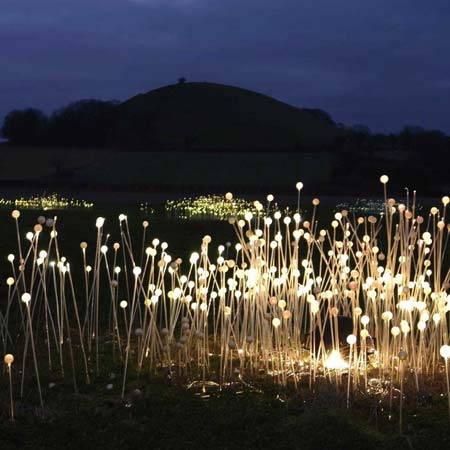
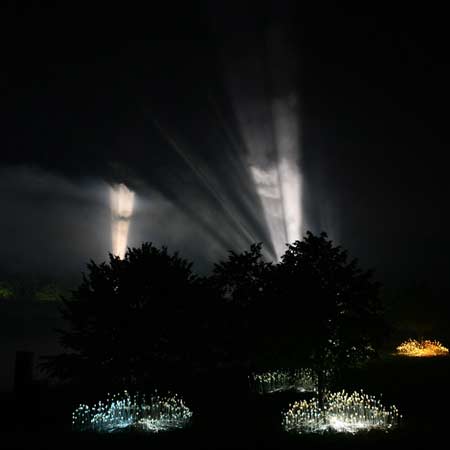
There are so many really nice light sculptures/art installations out already, but Lighting designer Bruce Munro shows that there are never enough. And that they keep getting even more beautiful.
Munro´s famous Field of Light (an apppropriate name) will be shown at the Eden Project in Cornwall, England, this winter. It was inspired by the way the desert flowers after a rainstorm.
“Munro was transfixed by the way the red desert was barren until it rained and then, as if from nowhere, dormant seeds would burst into bloom. He made a series of sketches in the notebook carried in his pocket since art college days, and the idea refused to dislodge from his mind.
Field of Light, like a giant surreal camp-side banana, is an alien installation in the midst of nature. And like dry desert seeds lying in wait for the rain, the sculpture’s fibre optic stems lie dormant until darkness falls, and then under a blazing blanket of stars they flower with gentle rhythms of light. ‘Field of Light’ is about the desert as much as the roadside campsites – and like much of Munro’s work is characterised by an almost mystical passion for nature teamed with a robust sense of humour.”
via Dezeen.
